Android 15 could revamp the volume panel and make it collapsible
TL;DR
- Android 15 is preparing a big redesign of the volume panel that also makes it collapsible.
- Android’s volume panel lets you change the media, call, ringer, notification, and alarm volume.
- The volume panel’s UI is a few years old and doesn’t follow the latest Material Design guidelines.
Back in 2021, Google released Material You, a major revamp to the company’s design language. Material You design elements were first incorporated into that year’s Android 12 release. Although Android’s current design hasn’t changed drastically since then, it has received minor tweaks in the few releases since. In the upcoming Android 15 release, Google is finally planning to revamp the system volume panel UI.
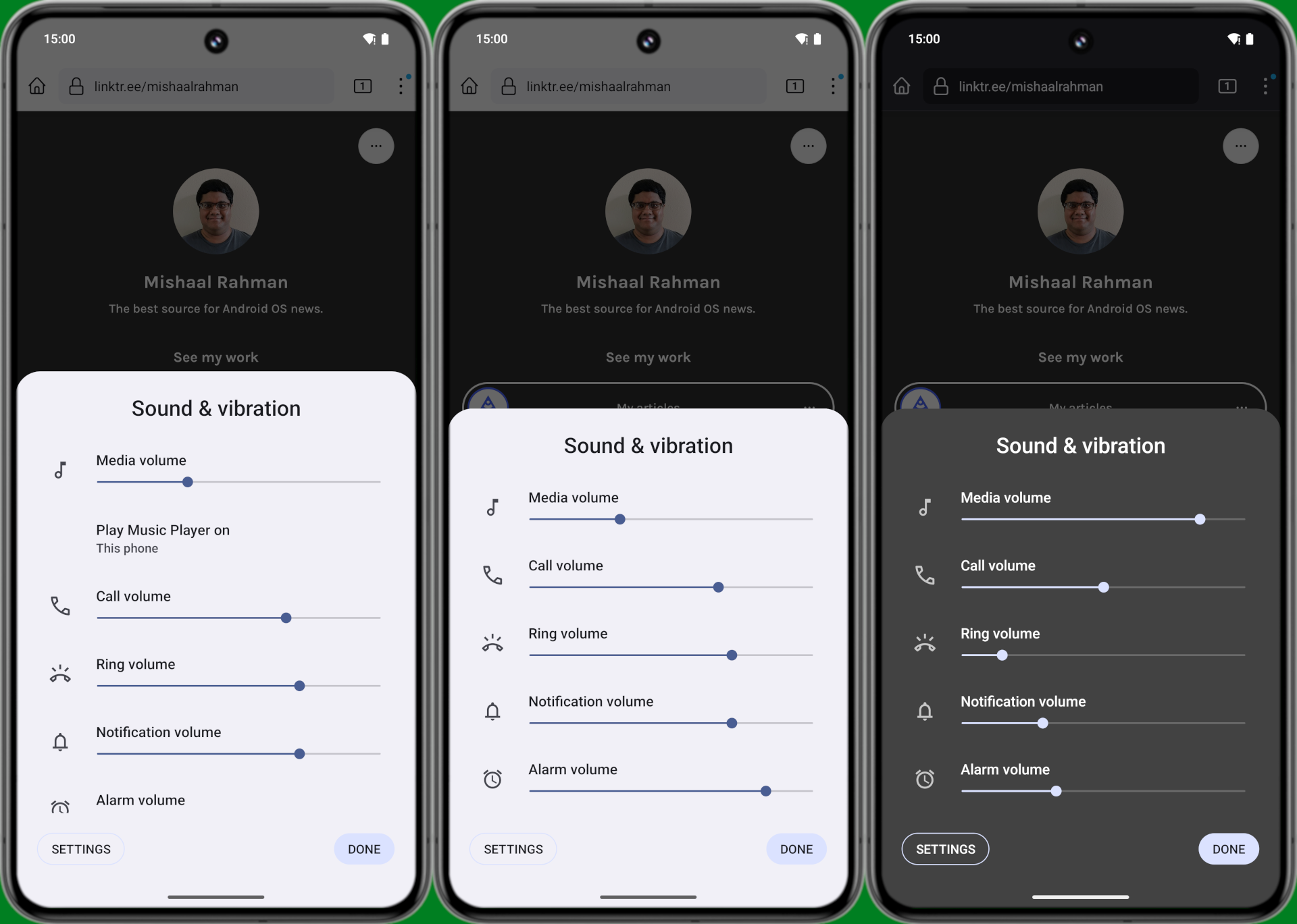
The volume panel appears when the user presses a volume key and then taps the three-dot menu at the bottom. The current design features five different sliders for each volume stream. From top to bottom, these include media, call, ring, notification, and alarm volume controls. A thin slider controls the level of each. Apart from the panel’s header, stream icons, and sliders, there are also buttons to open Android’s sound and vibration settings and dismiss the panel. Finally, if there’s any active media playback, a shortcut to open Android’s media output switcher will appear underneath the media volume slider.

Mishaal Rahman / Android Authority
Android’s current volume panel design is a carbon copy of the volume slider section under Settings > Sound & vibration. This is because the volume panel is actually comprised of “slices” — a feature introduced back in Android 9 Pie — taken from that very page.
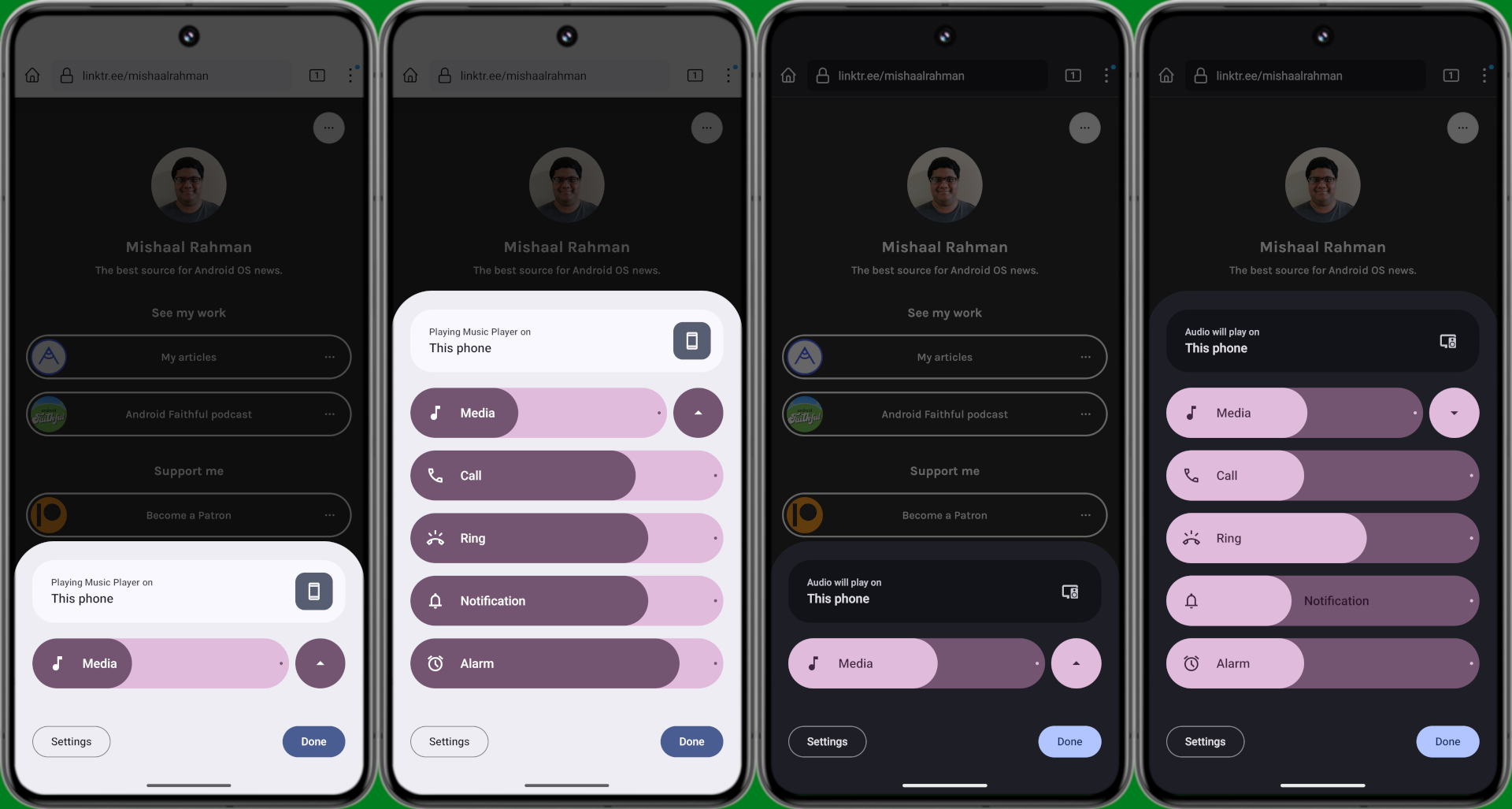
The new volume panel UI I was able to manually activate in the latest Android 15 Developer Preview 2 release, however, is decoupled from this. The new volume panel design, as shown below, features much thicker, pill-shaped sliders. A dot is placed at the end where the slider’s maximum value is, and the icons are also tappable to quickly mute that stream.

Mishaal Rahman / Android Authority
Android 15’s new volume panel is also collapsible. Tapping the button next to the media volume slider collapses or expands the panel. Whenever there’s active media playback, the volume panel is collapsed by default. Otherwise, it opens in its fully expanded state.
The “sound & vibration” header is also gone, and in its place is a persistent media output shortcut. Previously, the media output shortcut only appeared whenever there was active media playback. The updated design shows the shortcut regardless of media playback state. However, when there isn’t any active media playback, tapping the shortcut doesn’t open the media output switcher. Instead, it seems the shortcut remains just to tell the user which audio device is currently handling playback.
Google also added some playful animations to the new Android 15 volume panel. As you can see in the video up top, the stream name text moves with the slider so you can always see the stream name as you adjust the volume level. The current volume level is also shown in place of the icon whenever you’re moving the slider.
Apart from the new design, the volume panel will also surface additional controls for things like spatial audio and “noise control.” However, I wasn’t able to surface these controls during testing. This updated volume panel design isn’t enabled by default in the current Android 15 Developer Preview 2 build, but Google could roll it out in the upcoming beta release.