Google teases redesign for Sign in with Google with a ‘new look’ on the way

What you need to know
- Sign-in with Google is the feature that lets users log into other apps and websites with their Google account.
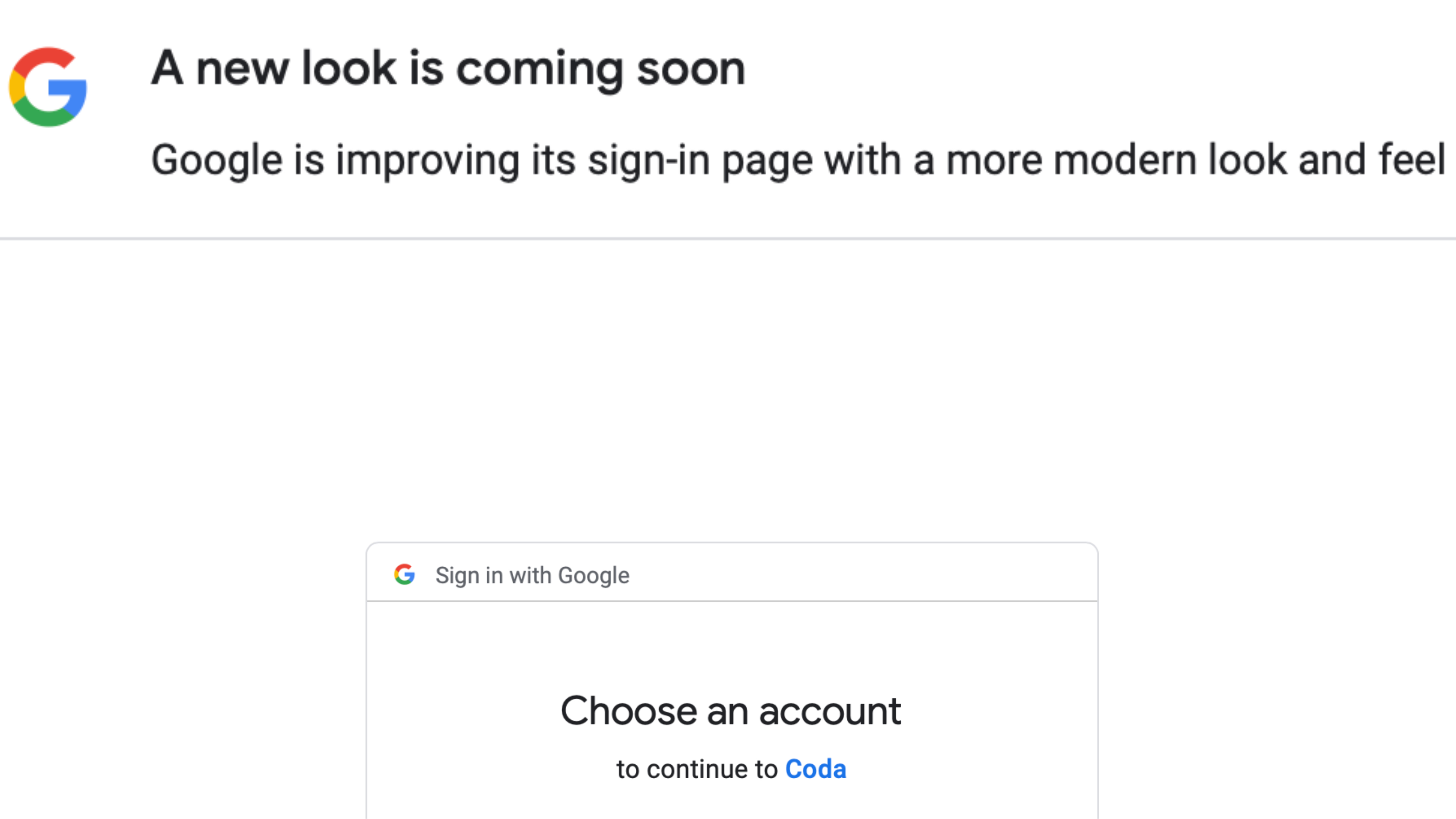
- Google is teasing a redesign for the Sign in with Google page through a banner message, describing a “modern look and feel” coming soon.
- We don’t have concrete details, but we suspect that the redesign could bring Material You elements or an emphasis on Passkeys.
Aside from granting access to Google Workspace and services like YouTube, Google Account owners can log into other apps and websites with their accounts. This can be useful for a few reasons, but most of all, it saves you time and hassle. Instead of creating new accounts for every app or site that requires them, you can just use your Google Account for them all.
This all happens through the Sign in with Google page, which you’ve probably used hundreds of times. Sign-in with Google hasn’t had major changes in quite a while, but now, Google is preparing users for a redesign. When you launch the Sign in with Google page now, you’ll be met with a banner that will remain visible until it is dismissed.
“A new look is coming soon,” the banner reads. “Google is improving the sign-in page with a more modern look and feel.”
That’s all Google is saying about the redesign, at least for now. We don’t know exactly what ‘a more modern look and feel’ means, but we have some guesses. With the Material You design language, Google has categorically changed the way it designs the look and user interface of its software and services. The overly-white colors and bland design of older Google products are being replaced with more colorful elements across the board.
With that in mind, it’s likely that the incoming redesign brings fresh ‘Material You Feel’ to the Sign-in with Google page. There are only so many ways a sign-in screen can be changed, so a colorful redesign seems the most plausible. Keep in mind that outside of the fact that a redesign is coming, we don’t have any details, so this is just speculation.
Another thing that Google could emphasize with a potential UI change is Passkeys. The company is stressing Passkeys as an alternative to traditional passwords, as they are more secure. If you aren’t signed into a Google Account on your device, going through the Sign in with Google page will bring up a prompt asking you to use Passkeys if you aren’t already.
Google started adding prompts for Passkeys in October of last year and enabled them by default for all Google users. With the impending redesign, it’s possible that Passkeys will become even more front-and-center than they already are.
The only thing left to do is wait and see what the Sign-in with Google redesign brings. For now, the banner message is a warning so that users aren’t surprised when the Sign-in with Google page changes in a little while.