Deep learning model architecture visualizations uncover a model’s internal structure and how data flows through it.
Activation heatmaps and feature visualizations provide insights into what a deep learning model “looks at” and how this information is processed inside the model.
Training dynamics plots and gradient plots show how a deep learning model learns and help to identify causes of stalling training progress.
Further, a lot of are applicable to deep learning models as well.
To successfully integrate deep learning model visualization into your data science workflow, follow this guideline:
Establish a clear purpose. What goal are you trying to achieve through visualizations?
Choose the appropriate visualization technique. Generally, starting from an abstract high-level visualization and subsequently diving deeper is the way to go.
Select the right libraries and tools. Some visualization approaches are framework-agnostic, while other implementations are specific to a deep learning framework or a particular family of models.
Iterate and improve. It’s unlikely that your first visualization fully meets your or your stakeholders’ needs.
For a more in-depth discussion, check out the section in my article on visualizing machine learning models.
There are several ways to visualize TensorFlow models. To generate architecture visualizations, you can use the plot_model and model_to_dot utility functions in tensorflow.keras.utils.
If you would like to explore the structure and data flows within a TensorFlow model interactively, you can use TensorBoard, the open-source experiment tracking and visualization toolkit maintained by the TensorFlow team. Look at the official Examining the TensorFlow Graph tutorial to learn how.
You can use PyTorchViz to create model architecture visualizations for PyTorch deep learning models. These visualizations provide insights into data flow, activation functions, and how the different model components are interconnected.
Here are three visualization approaches that work well for convolutional neural networks:
Feature visualization: Uncover which features the CNN’s filters detect across the layers. Typically, lower layers detect basic structures like edges, while the upper layers detect more abstract concepts and relationships between image elements.
Activation Maps: Get insight into which areas of the input image lead to the highest activations as data flows through the CNN. This allows you to see what the model focuses on when computing its prediction.
Deep Feature Factorization: Examine which abstract concepts the CNN has learned and verify that they are meaningful semantically.
Transformer models are based on attention mechanisms and embeddings. Naturally, this is what visualization techniques focus on:
Attention visualizations uncover what parts and elements of the input a transformer model attends to. They help you understand the contextual information the model extracts and how attention flows through the model.
Visualizing embeddings typically involves projecting these high-dimensional vectors into a two- or three-dimensional space where embedding vectors representing similar concepts are grouped closely together.
Deep learning models are highly complex. Even for data scientists and machine learning engineers, it can be difficult to grasp how data flows through them. Deep learning visualization techniques provide a wide range of ways to reduce this complexity and foster insights through graphical representations.
Visualizations are also helpful when communicating deep learning results to non-technical stakeholders. Heatmaps, in particular, are a great way to convey how a model identifies relevant information in the input and transforms it into a prediction.
Was the article useful?
Thank you for your feedback!
Explore more content topics:
Deep learning models are typically highly complex. While many traditional machine learning models make do with just a couple of hundreds of parameters, deep learning models have millions or billions of parameters. The large language model GPT-4 that OpenAI released in the spring of 2023 is rumored to have nearly 2 trillion parameters. It goes without saying that the interplay between all these parameters is way too complicated for humans to understand.
This is where visualizations in ML come in. Graphical representations of structures and data flow within a deep learning model make its complexity easier to comprehend and enable insight into its decision-making process. With the proper visualization method and a systematic approach, many seemingly mysterious training issues and underperformance of deep learning models can be traced back to root causes.
In this article, we’ll explore a wide range of deep learning visualizations and discuss their applicability. Along the way, I’ll share many practical examples and point to libraries and in-depth tutorials for individual methods.
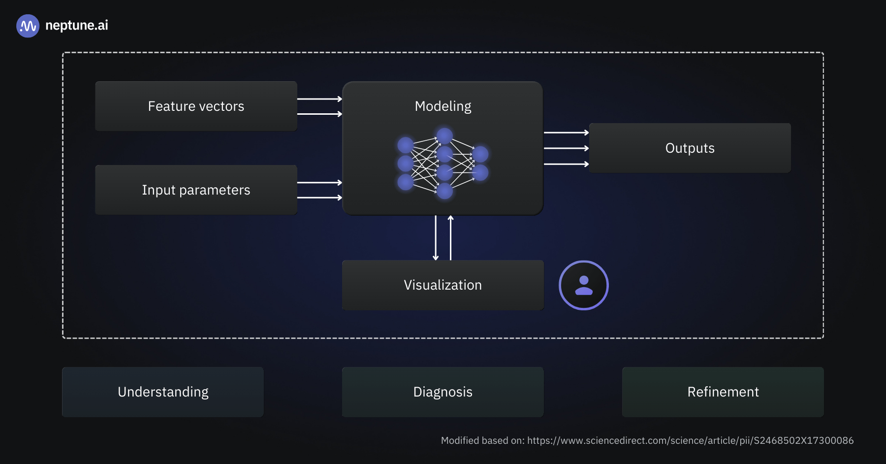
Deep learning model visualization helps us understand model behavior and differences between models, diagnose training processes and performance issues, and aid the refinement and optimizations of models | Source
Why do we want to visualize deep learning models?
Visualizing deep learning models can help us with several different objectives:
Interpretability and explainability: The performance of deep learning models is, at times, staggering, even for seasoned data scientists and ML engineers. Visualizations provide ways to dive into a model’s structure and uncover why it succeeds in learning the relationships encoded in the training data.
Debugging model training: It’s fair to assume that everyone training deep learning models has encountered a situation where a model doesn’t learn or struggles with a particular set of samples. The reasons for this range from wrongly connected model components to misconfigured optimizers. Visualizations are great for monitoring training runs and diagnosing issues.
Model optimization: Models with fewer parameters are generally faster to compute and more resource-efficient while being more robust and generalizing better to unseen samples. Visualizations can uncover which parts of a model are essential – and which layers might be omitted without compromising the model’s performance.
Understanding and teaching concepts: Deep learning is mostly based on fairly simple activation functions and mathematical operations like matrix multiplication. Many high school students will know all the maths required to understand a deep learning model’s internal calculations step-by-step. But it’s far from obvious how this gives rise to models that can seemingly “understand” images or translate fluently between multiple languages. It’s not a secret among educators that good visualizations are key for students to master complex and abstract concepts such as deep learning. Interactive visualizations, in particular, have proven helpful for those new to the field.
Example of a deep learning visualization: small convolutional neural network CNN, notice how the thickness of the colorful lines indicates the weight of the neural pathways |Source
How is deep learning visualization different from traditional ML visualization?
At this point, you might wonder how visualizing deep learning models differs from visualizations of traditional machine learning models. After all, aren’t deep learning models closely related to their predecessors?
Deep learning models are characterized by a large number of parameters and a layered structure. Many identical neurons are organized into layers stacked on top of each other. Each neuron is described through a small number of weights and an activation function. While the activation function is typically chosen by the model’s creator (and is thus a so-called hyperparameter), the weights are learned during training.
This fairly simple structure gives rise to unprecedented performance on virtually every machine learning task known today. From our human perspective, the price we pay is that deep learning models are much larger than traditional ML models.
It’s also much more difficult to see how the intricate network of neurons processes the input data than to comprehend, say, a decision tree. Thus, the main focus of deep learning visualizations is to uncover the data flow within a model and to provide insights into what the structurally identical layers learn to focus on during training.
That said, many of the machine learning visualization techniques I covered in my last blog post apply to deep learning models as well. For example, confusion matrices and ROC curves are helpful when working with deep learning classifiers, just as they are for more traditional classification models.
Who should use deep learning visualization?
The short answer to that question is: Everyone who works with deep learning models!
In particular, the following groups come to mind:
Deep learning researchers: Many visualization techniques are first developed by academic researchers looking to improve existing deep learning algorithms or to understand why a particular model exhibits a certain characteristic.
Data scientists and ML engineers: Creating and training deep learning models is no easy feat. Whether a model underperforms, struggles to learn, or generates suspiciously good outcomes – visualizations help us to identify the root cause. Thus, mastering different visualization approaches is an invaluable addition to any deep learning practitioner’s toolbox.
Downstream consumers of deep learning models: Visualizations prove valuable to individuals with technical backgrounds who consume deep learning models via APIs or integrated deep learning-based components into software applications. For instance, Facebook’s ActiVis is a visual analytics system tailored to in-house engineers, facilitating the exploration of deployed neural networks.
Educators and students: Those encountering deep neural networks for the first time – and the people teaching them – often struggle to understand how the model code they write translates into a computational graph that can process complex input data like images or speech. Visualizations make it easier to understand how everything comes together and what a model learned during training.
Types of deep learning visualization
There are many different approaches to deep learning model visualization. Which one is right for you depends on your goal. For instance, deep learning researchers often delve into intricate architectural blueprints to uncover the contributions of different model parts to its performance. ML engineers are often more interested in plots of evaluation metrics during training, as their goal is to ship the best-performing model as quickly as possible.
In this article, we’ll discuss the following approaches:
Deep learning model architecture visualization: Graph-like representation of a neural network with nodes representing layers and edges representing connections between neurons.
Activation heatmap: Layer-wise visualization of activations in a deep neural network that provides insights into what input elements a model is sensitive to.
Feature visualization: Heatmaps that visualize what features or patterns a deep learning model can detect in its input.
Deep feature factorization: Advanced method to uncover high-level concepts a deep learning model learned during training.
Training dynamics plots: Visualization of model performance metrics across training epochs.
Gradient plots: Representation of the loss function gradients at different layers within a deep learning model. Data scientists often use these plots to detect exploding or vanishing gradients during model training.
Loss landscape: Three-dimensional representation of the loss function’s value across a deep learning model’s input space.
Visualizing attention: Heatmap and graph-like visual representations of a transformer-model’s attention that can be used, e.g., to verify if a model focuses on the correct parts of the input data.
Visualizing embeddings: Graphical representation of embeddings, an essential building block for many NLP and computer vision applications, in a low-dimensional space to unveil their relationships and semantic similarity.
Deep learning model architecture visualization
Visualizing the architecture of a deep learning model – its neurons, layers, and connections between them – can serve many purposes:
It exposes the flow of data from the input to the output, including the shapes it takes when it’s passed between layers.
It gives a clear idea of the number of parameters in the model.
You can see which components repeat throughout the model and how they’re linked.
There are different ways to visualize a deep learning model’s architecture:
Model diagrams expose the model’s building blocks and their interconnection.
Flowcharts aim to provide insights into data flows and model dynamics.
Layer-wise representations of deep learning models tend to be significantly more complex and expose activations and intra-layer structures.
All of these visualizations do not only satisfy curiosity. They empower deep learning practitioners to fine-tune models, diagnose issues, and build upon this knowledge to create even more powerful algorithms.
You’ll be able to find model architecture visualization utilities for all of the big deep learning frameworks. Sometimes, they are provided as part of the main package, while in other cases, separate libraries are provided by the framework’s maintainers or community members.
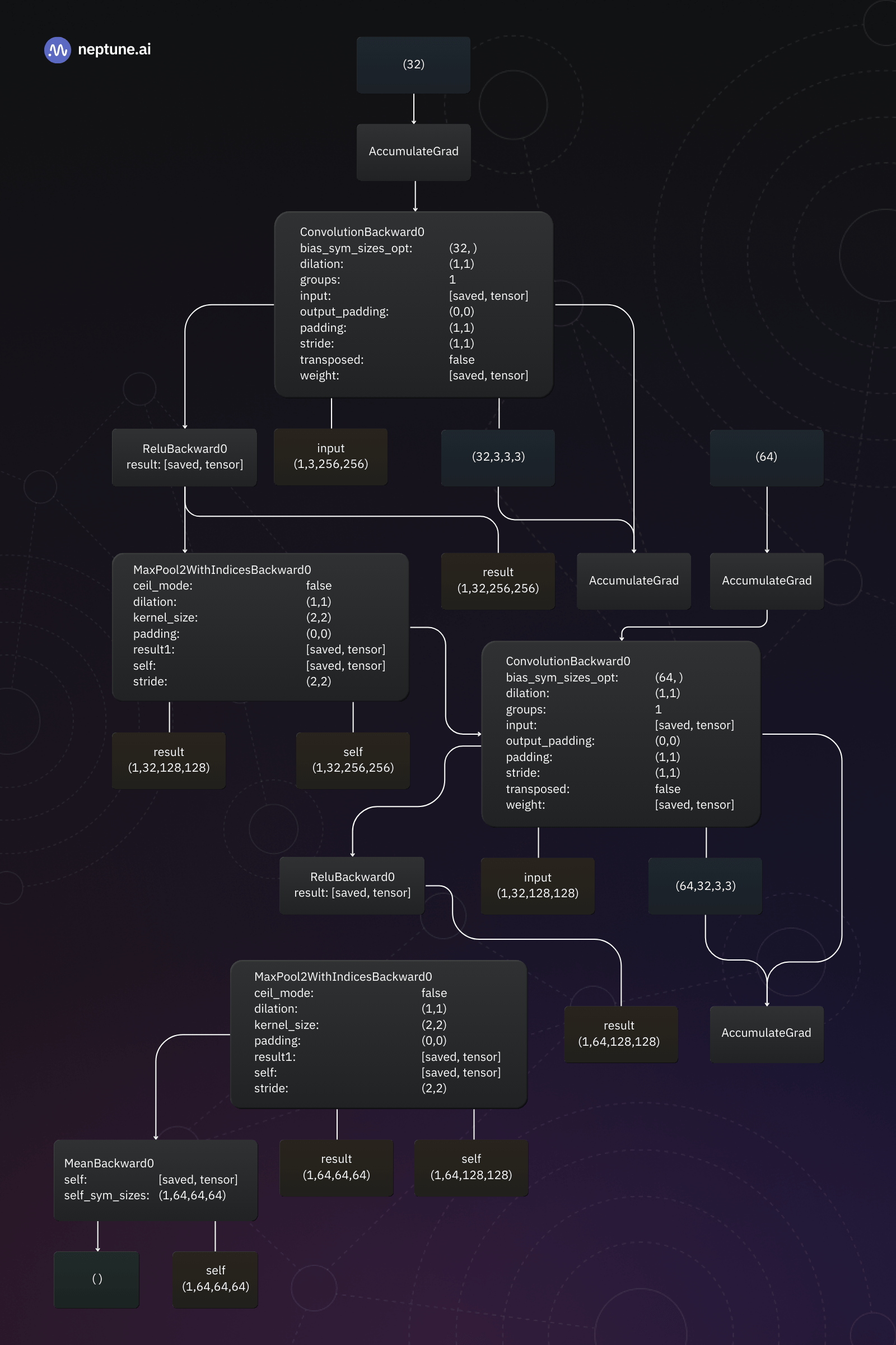
How do you visualize a PyTorch model’s architecture?
If you are using PyTorch, you can use PyTorchViz to create model architecture visualizations. This library visualizes a model’s individual components and highlights the data flow between them.
Model architecture diagram of a Keras-based neural network | Source: Author
The output generated by the plot_model function is quite simple to understand: Each box represents a model layer and shows its name, type, and input and output shapes. The arrows indicate the flow of data between layers.
By the way, Keras also provides a model_to_dot function to create graphs similar to the one produced by PyTorchViz above.
Activation heatmaps
Activation heatmaps are visual representations of the inner workings of deep neural networks. They show which neurons are activated layer-by-layer, allowing us to see how the activations flow through the model.
An activation heatmap can be generated for just a single input sample or a whole collection. In the latter case, we’ll typically choose to depict the average, median, minimum, or maximum activation. This allows us, for example, to identify regions of the network that rarely contribute to the model’s output and might be pruned without affecting its performance.
Let’s take a computer vision model as an example. To generate an activation heatmap, we’ll feed a sample image into the model and record the output value of each activation function in the deep neural network. Then, we can create a heatmap visualization for a layer in the model by coloring its neurons according to the activation function’s output. Alternatively, we can color the input sample’s pixels based on the activation they cause in the inner layer. This tells us which parts of the input reach the particular layer.
For typical deep learning models with many layers and millions of neurons, this simple approach will produce very complicated and noisy visualizations. Hence, deep learning researchers and data scientists have come up with plenty of different methods to simplify activation heatmaps.
But the goal remains the same: We want to uncover which parts of our model contribute to the output and in what way.
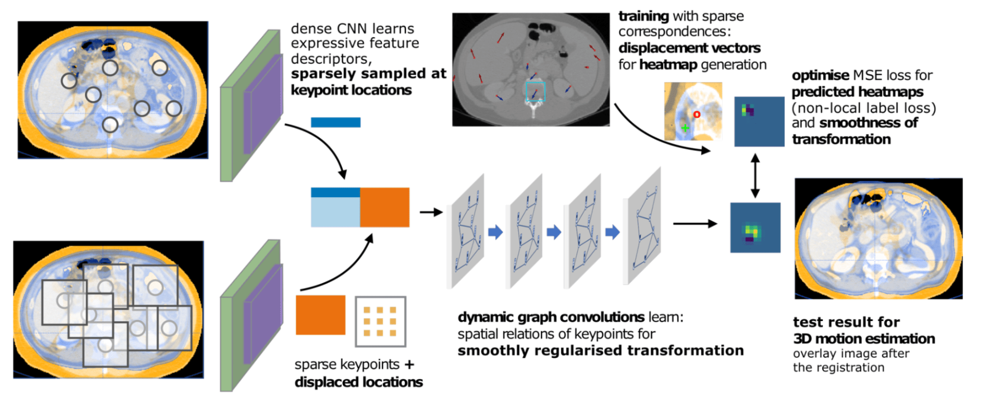
Generation of activation heatmaps for a CNN analyzing MRI data | Source
For instance, in the example above, activation heatmaps highlight the regions of an MRI scan that contributed most to the CNN’s output.
Providing such visualizations along with the model output aids healthcare professionals in making informed decisions. Here’s how:
Lesion detection and abnormality identification: The heatmaps highlight the crucial areas in the image, aiding in the identification of lesions and abnormalities.
Severity assessment of abnormalities: The intensity of the heatmap directly correlates with the severity of lesions or abnormalities. A larger and brighter area on the heatmap indicates a more severe condition, enabling a quick assessment of the issue.
Identifying model mistakes: If the model’s activation is high for areas of the MRI scan that are not medically significant (e.g., the skull cap or even parts outside of the brain), this is a telltale sign of a mistake. Even without deep learning expertise, medical professionals will immediately see that this particular model output cannot be trusted.
How do you create a visualization heatmap for a PyTorch model?
The TorchCam library provides several methods to generate activation heatmaps for PyTorch models.
To generate an activation heatmap for a PyTorch model, we need to take the following steps:
Once we have computed them, we can plot the activation heatmaps for each layer in the model:
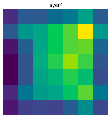
In my example model’s case, the output is not overly helpful:
Creating a visualization heatmap for a PyTorch model (layer) | Source: Author
We can greatly enhance the plot’s value by overlaying the original input image. Luckily for us, TorchCam provides the overlay_mask utility function for this purpose:
Original input image overlaid with an activation heatmap of the fourth layer in a ResNet18 | Source: Author
As you can see in the example plot above, the activation heatmap exposes the areas of the input image that resulted in the greatest activation of neurons in the inner layer of the deep learning model. This helps engineers and the general audience to understand what’s happening inside the model.
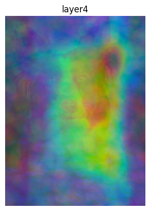
Feature visualization
Feature visualization reveals the features learned by a deep neural network. It is particularly helpful in computer vision, where it reveals which abstract features in an input image a neural network responds to. For example, that a neuron in a CNN architecture is highly responsive to diagonal edges or textures like fur.
This helps us understand what the model is looking for in images. The main difference to the activation heatmaps discussed in the previous section is that these show the general response to regions of an input image, whereas feature visualization goes a level deeper and attempts to uncover a model’s response to abstract concepts.
Through feature visualization, we can gain valuable insights into the specific features that deep neural networks are processing at different layers. Generally, layers close to the model’s input will respond to simpler features like edges, while layers closer to the model’s output will detect more abstract concepts.
Such insights not only aid in understanding the inner workings but also serve as a toolkit for fine-tuning and enhancing the model’s performance. By inspecting the features that are activated incorrectly or inconsistently, we can refine the training process or identify data quality issues.
In my Colab notebook for this article, you can find the full example code for generating feature visualizations for a PyTorch CNN. Here, we’ll focus on discussing the result and what we can learn from it.
Feature visualization plots for a ResNet18 processing the image of a dog | Source: Author
As you can see from the plots above, the CNN detects different patterns or features in every layer. If you look closely at the upper row, which corresponds to the first four layers of the model, you can see that those layers detect the edges in the image. For instance, in the second and fourth panels of the first row, you can see that the model identifies the nose and the ears of the dog.
As the activations flow through the model, it becomes ever more challenging to make out what the model is detecting. But if we analyzed more closely, we would likely find that individual neurons are activated by, e.g., the dog’s ears or eyes.
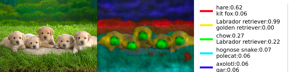
Deep feature factorizations
Deep Feature Factorizatio (DFF) is a method to analyze the features a convolutional neural network has learned. DFF identifies regions in the network’s feature space that belong to the same semantic concept. By assigning different colors to these regions, we can create a visualization that allows us to see whether the features identified by the model are meaningful.
Deep feature visualization for a computer vision model | Source
For instance, in the example above, we find that the model bases its decision (that the image shows labrador retrievers) on the puppies, not the surrounding grass. The nose region might point to a chow, but the shape of the head and ears push the model toward “labrador retriever.” This decision logic mimics the way a human would approach the task.
DFF is available in PyTorch-gradcam, which comes with an extensive DFF tutorial that also discusses how to interpret the results. The image above is based on this tutorial. I have simplified the code and added some additional comments. You’ll find my recommended approach to Deep Feature Factorization with PyTorch-gradcam in the Colab notebook.
Training dynamics plots
Training dynamics plots show how a model learns. Training progress is typically gauged through performance metrics such as loss and accuracy. By visualizing these metrics, data scientists and deep learning practitioners can obtain crucial insights:
Learning Progression: Training dynamics plots reveal how quickly or slowly a model converges. Rapid convergence can point to overfitting, while erratic fluctuations may indicate issues like poor initialization or improper learning rate tuning.
Early Stopping: Plotting losses helps to identify the point at which a model starts overfitting the training data. A decreasing training loss while the validation loss rises is a clear sign of overfitting. The point where overfitting sets in is the optimal time to halt training.
Plots of loss over training epochs for various deep learning models | Source
Training loss, validation dice coefficient (also known as F1 score), and validation loss for a model training run in neptune.ai
Gradient plots
If plots of performance metrics are insufficient to understand a model’s training progress (or lack thereof), plotting the loss function’s gradients can be helpful.
To adjust the weights of a neural network during training, we use a technique called backpropagation to compute the gradient of the loss function with respect to the weights and biases of our network. The gradient is a high-dimensional vector that points in the direction of the steepest increase of the loss function. Thus, we can use that information to shift our weights and biases in the opposite direction. The learning rate controls the amount by which we change the weights and biases.
Vanishing or exploding gradients can prevent deep neural networks from learning. Plotting the mean magnitude of gradients for different layers can reveal whether gradients are vanishing (approaching zero) or exploding (becoming extremely large). If the gradient vanishes, we have no idea in which direction to shift our weights and biases, so training is stuck. An exploding gradient leads to large changes in the weights and biases, often overshooting the target and causing rapid fluctuations in the loss.
Machine learning experiment trackers like neptune.ai enable data scientists and ML engineers to track and plot gradients during training.
Gradient plots for two different layers of a deep neural network in neptune.ai
Do you feel like experimenting with neptune.ai?
To learn more about vanishing and exploding gradients and how to use gradient plots to detect them, I recommend Katherine Li’s in-depth blog post on debugging, monitoring, and fixing gradient-related problems.
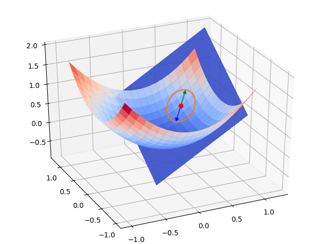
Loss landscapes
We can not just plot gradient magnitudes but directly visualize the loss function and its gradients. These visualizations are commonly called “loss landscapes.”
Inspecting a loss landscape helps data scientists and machine learning practitioners understand how an optimization algorithm moves the weights and biases in a model toward a loss function’s minimum.
A plot of the region around a loss function’s local minimum with an inscribed gradient vector | Source
In an idealized case like the one shown in the figure above, the loss landscape is very smooth. The gradient only changes slightly across the surface. Deep neural networks often exhibit a much more complex loss landscape with spikes and trenches. Reliably converging towards a minimum of the loss function in these cases requires robust optimizers such as Adam.
Loss landscapes do not only provide insight into how deep learning models learn, but they can also be beautiful to look at. Javier Ideami has created the Loss Landscape project with many artistic videos and interactive animations of various loss landscapes.
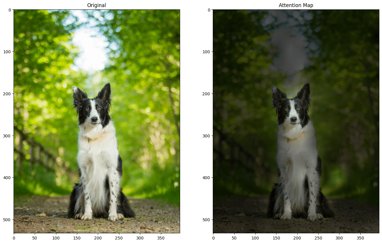
Visualizing attention
Famously, the transformer models that have revolutionized deep learning over the past few years are based on attention mechanisms. Visualizing what parts of the input a model attends to provides us with important insights:
Interpreting self-attention: Transformers utilize self-attention mechanisms to weigh the importance of different parts of the input sequence. Visualizing attention maps helps us grasp which parts the model focuses on.
Diagnosing errors: When the model attends to irrelevant parts of the input sequence, it can lead to prediction mistakes. Visualization allows us to detect such issues.
Exploring contextual information: Transformer models excel at capturing contextual information from input sequences. Attention maps show how the model distributes attention across the input’s elements, revealing how context is built and propagated through layers.
Understanding how transformers work: Visualizing attention and its flow through the model at different stages helps us understand how transformers process their input. Jacob Gildenblat’s Exploring Explainability for Vision Transformers takes you on a visual journey through Facebook’s Data-efficient Image Transformer (deit-tiny).
The image on the left is original. On the right, it’s overlaid with an attention map. You can see that the model allocates the most attention to the dog | Source: Author
Visualizing embeddings
Embeddings are high-dimensional vectors that capture semantic information. Nowadays, they are typically generated by deep learning models. Visualizing embeddings helps to understand this complex, high-dimensional data.
Typically, embeddings are projected down to a two- or three-dimensional space and represented by points. Standard techniques include principal component analysis, t-SNE, and UMAP. I’ve covered the latter two in-depth in the section on visualizing cluster analysis in my article on machine learning visualization.
Thus, it is no surprise that embedding visualizations reveal data patterns, similarities, and anomalies by grouping embeddings into clusters. For instance, if you visualize word embeddings with one of the methods mentioned above, you’ll find that semantically similar words will end up close together in the projection space.
Embeddings for MNIST represented in a 3D space | Source
When to use which deep learning visualization
We can break down the deep learning model lifecycle into four different phases:
1
Pre-training
2
During training
3
Post-training
4
Inference
Each of these phases requires different visualizations.
Pre-training deep learning model visualization
During early model development, finding a suitable model architecture is the most essential task.
Architecture visualizations offer insights into how your model processes information. To understand the architecture of your deep learning model, you can visualize the layers, their connections, and the data flow between them.
Deep learning model visualization during model training
In the training phase, understanding training progress is crucial. To this end, training dynamics and gradient plots are the most helpful visualizations.
If training does not yield the expected results, feature visualizations or inspecting the model’s loss landscape in detail can provide valuable insights. If you’re training transformer-based models, visualizing attention or embeddings can lead you on the right path.
Post-training deep learning model visualizations
Once the model is fully trained, the main goal of visualizations is to provide insights into how a model processes data to produce its outputs.
Activation heatmaps uncover which parts of the input are considered most important by the model. Feature visualizations reveal the features a model learned during training and help us understand what patterns a model is looking for in the input data at different layers. Deep Feature Factorization goes a step further and visualizes regions in the input space associated with the same concept.
If you’re working with transformers, attention and embedding visualizations can help you validate that your model focuses on the most important input elements and captures semantically meaningful concepts.
Inference
At inference time – when a model is used to make predictions or generate outputs – visualizations can help monitor and debug cases where a model went wrong.
The methods used are the same as the ones you might use in the post-training phase but the goal is different: Instead of understanding the model as a whole, we’re now interested in how the model handles an individual input instance.
Conclusion
We covered a lot of ways to visualize deep learning models. We started by asking why we might want visualizations in the first place and then looked into several techniques, often accompanied by hands-on examples. Finally, we discussed where in the model lifecycle the different deep learning visualization approaches promise the most valuable insights.
I hope you enjoyed this article and have some ideas about which visualizations you will explore for your current deep learning projects. The visualization examples in my Colab notebook can serve as starting points. Please feel free to copy and adapt them to your needs!
FAQ
Deep learning model visualizations are approaches and techniques to render complex neural networks more understandable through graphical representations. Deep learning models consist of many layers described by millions of parameters. Model visualizations transform this complexity into a visual language that humans can comprehend.
Deep learning model visualization can be as simple as plotting curves to understand how a model’s performance changes over time or as sophisticated as generating three-dimensional heatmaps to grasp how the different layers of a model contribute to its output.
One common approach for visualizing a deep learning model’s architecture is graphs illustrating the connections and data flow between its components.
You can use the PyTorchViz library to generate architecture visualizations for PyTorch models. If you’re using TensorFlow or Keras, check out the integrated model plotting utilities.
There are many ways to visualize deep learning models:
Deep learning model architecture visualizations uncover a model’s internal structure and how data flows through it.
Activation heatmaps and feature visualizations provide insights into what a deep learning model “looks at” and how this information is processed inside the model.
Training dynamics plots and gradient plots show how a deep learning model learns and help to identify causes of stalling training progress.
Further, a lot of are applicable to deep learning models as well.
To successfully integrate deep learning model visualization into your data science workflow, follow this guideline:
Establish a clear purpose. What goal are you trying to achieve through visualizations?
Choose the appropriate visualization technique. Generally, starting from an abstract high-level visualization and subsequently diving deeper is the way to go.
Select the right libraries and tools. Some visualization approaches are framework-agnostic, while other implementations are specific to a deep learning framework or a particular family of models.
Iterate and improve. It’s unlikely that your first visualization fully meets your or your stakeholders’ needs.
For a more in-depth discussion, check out the section in my article on visualizing machine learning models.
There are several ways to visualize TensorFlow models. To generate architecture visualizations, you can use the plot_model and model_to_dot utility functions in tensorflow.keras.utils.
If you would like to explore the structure and data flows within a TensorFlow model interactively, you can use TensorBoard, the open-source experiment tracking and visualization toolkit maintained by the TensorFlow team. Look at the official Examining the TensorFlow Graph tutorial to learn how.
You can use PyTorchViz to create model architecture visualizations for PyTorch deep learning models. These visualizations provide insights into data flow, activation functions, and how the different model components are interconnected.
Here are three visualization approaches that work well for convolutional neural networks:
Feature visualization: Uncover which features the CNN’s filters detect across the layers. Typically, lower layers detect basic structures like edges, while the upper layers detect more abstract concepts and relationships between image elements.
Activation Maps: Get insight into which areas of the input image lead to the highest activations as data flows through the CNN. This allows you to see what the model focuses on when computing its prediction.
Deep Feature Factorization: Examine which abstract concepts the CNN has learned and verify that they are meaningful semantically.
Transformer models are based on attention mechanisms and embeddings. Naturally, this is what visualization techniques focus on:
Attention visualizations uncover what parts and elements of the input a transformer model attends to. They help you understand the contextual information the model extracts and how attention flows through the model.
Visualizing embeddings typically involves projecting these high-dimensional vectors into a two- or three-dimensional space where embedding vectors representing similar concepts are grouped closely together.
Deep learning models are highly complex. Even for data scientists and machine learning engineers, it can be difficult to grasp how data flows through them. Deep learning visualization techniques provide a wide range of ways to reduce this complexity and foster insights through graphical representations.
Visualizations are also helpful when communicating deep learning results to non-technical stakeholders. Heatmaps, in particular, are a great way to convey how a model identifies relevant information in the input and transforms it into a prediction.